The Leadership Space
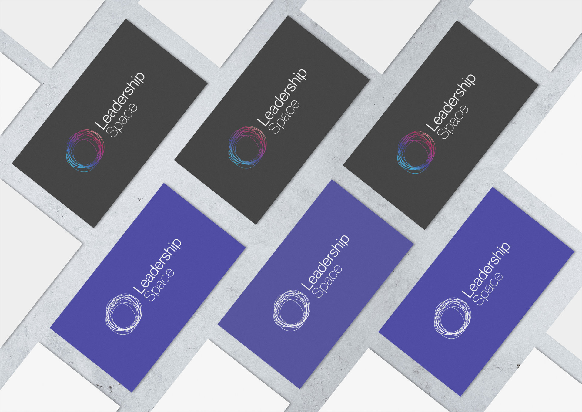
The Leadership Space is a leadership development consultancy focusing on executives, women, diverse leaders and their teams. The brief for the brand identity was to represent a place of inclusion and diversity while also appearing dynamic in its nature. The circle represents this place, along with the colours symbolising the diversity. The organic approach of the logomark brings the dynamic element of the brand.
Kokoda Track Foundation
Kokoda Track Foundation works with people and communities to improve the lives and futures of indigenous Papua New Guineans. Their brand identity needed to be relatable for those communities on the ground in PNG, along with those looking to provide support and funding from Australia. The logo represents the Queen Alexandra's birdwing, a butterfly native only to PNG. The symbolism of this butterfly also relates to the positive ripple effect the organisation has in communities.
Plus+

Plus+ is building to be Australia’s leading integrated program for people with complex behaviours. The logo required their four pillars of clinical ethos to be represented; person-centred, collaborative, adaptable and accessible and positive intent. Each arm of the cross symbolises these pillars moving towards a single point of focus.
i3 Investment Innovation Institute
The Investment Innovation Institute [i3] is committed to better investment outcomes through education. They needed a brand identity refresh to go along with a redesigned website. The colours were taken from the previous logomark and used to create a circular icon representing a completed, simplified puzzle. These three 'puzzle' elements symbolise the arms of the business working together as one: transformation, institutions and investments.
The Messey Table

The Messey Table offers seasonally savvy cooking, eating and education with sustainability at heart. This brand needed a logo refresh to launch new business offerings but wanted to keep the handmade feel of its previous identity. The new logo uses a rustic, organic typeface creating an ink stamp appearance.
The Funding Network
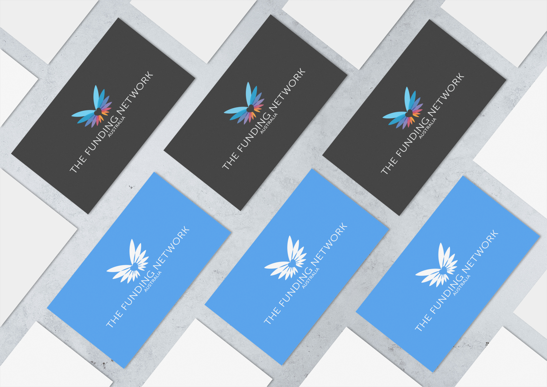
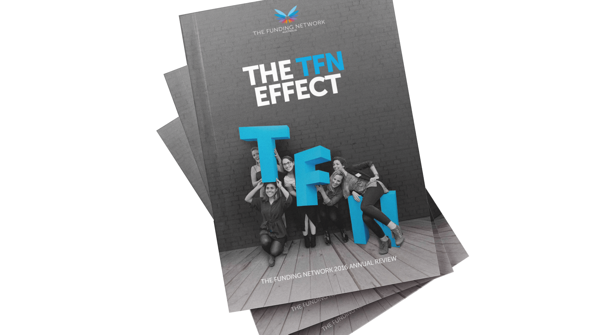
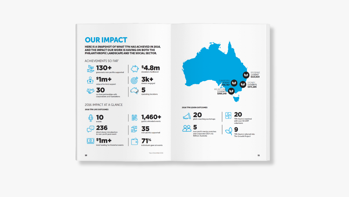
The Funding Network provides a platform to raise funds and create the connections, confidence, training and support necessary to fuel growth. The logomark features stylised wings which represent the transformation from chrysalis to maturity, fueled by TFN.

